Rethinking How Groups Buy Movie Tickets
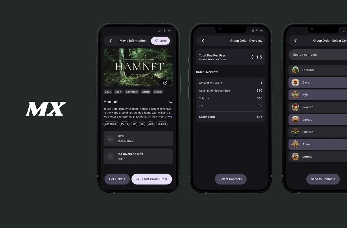
Understanding the Problem and Goal
From initial research I identified that cinema sites often do not include sharing features for movie details and showtime information. In another round of competitive research, I did not find cinemas offering group-ordering features at all. Since a majority of users indicated that they go to the cinema with more than one person, enabling group-ordering was the main goal of this project.
Group ordering emerged mid-project. The initial scope was a sharing feature, useful for coordinating what to watch, but silent on the actual purchase. That gap only became visible through building and testing.
The central objective from the start was: Design a clear, fast, and easy digital experience for purchasing movie tickets, individually and as part of a group, with a focus on accessibility and alternative payment methods.
Initial Research
I conducted 3 user interviews to understand how people currently experience cinema ticketing, and surveyed 6+ people on their cinema-going habits. The answer was consistent: group cinema-going is the norm, and the tools to support it are missing. From this research I identified the following:
Process: Movie ticketing apps are crammed with information, distracting promotions, and often do not include movie sharing features.
Interaction: Available seats can be poorly displayed for accurate selection on desktop and a mobile screen, often overflowing.
Accessibility: Some ticketing apps are not fully equipped with assistive technologies.
Experience: Few ticketing apps include an option for sharing movie information and showtime. None of them offer a group-order experience.
From Big Picture to Lo-Fidelity Prototype
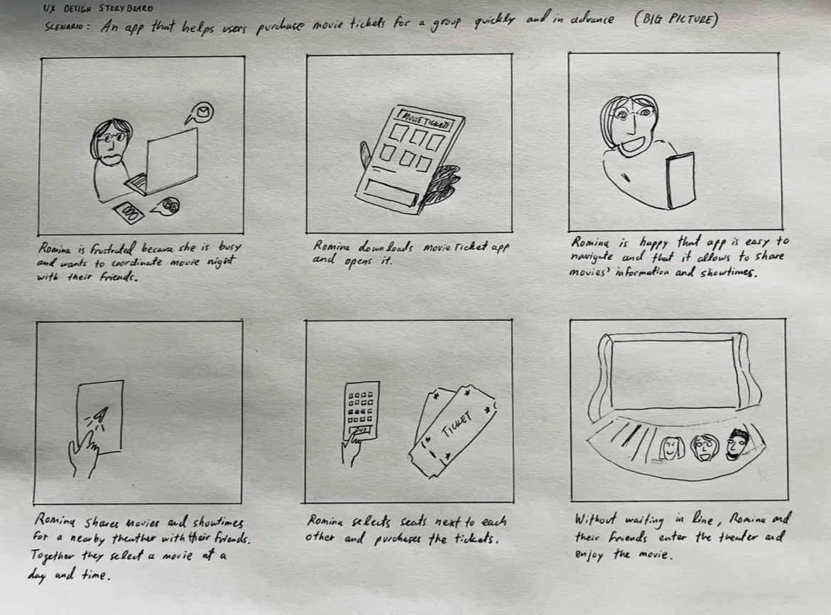
With the goal of designing for simplicity, group-orders, and payment alternatives, I brainstormed ideas and sketched scenarios. One of the artifacts I created is a big-picture storyboard that helped me keep the main process of going to the cinema as a group in mind.
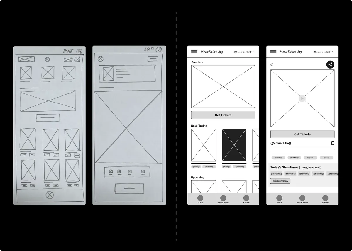
Drafting screens on paper made it easier to translate into digital wireframes and to speed up the design process. I polished wireframes into a lo-fidelity prototype to get user feedback before moving on to a hi-fidelity version.
Round One Usability Tests
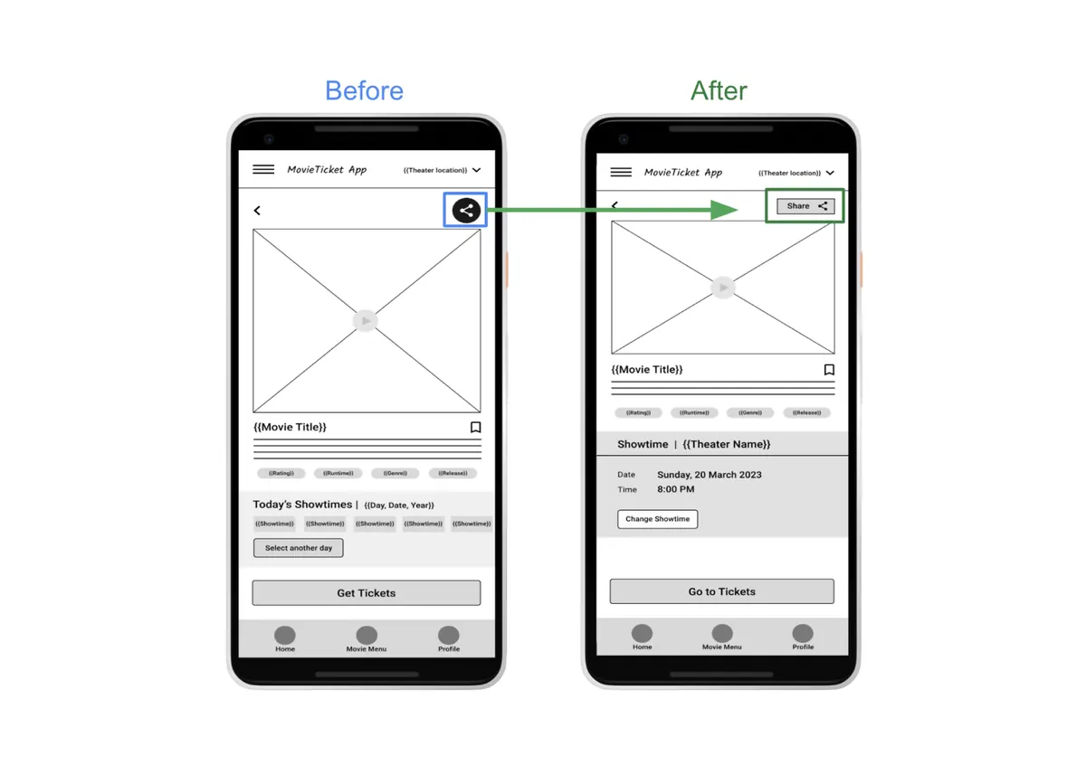
I ran two rounds of remote usability testing, 5 participants each, 10 total. Testing the main user flow in lo-fidelity prototypes revealed many problems and provided valuable insights. Although I had prioritized the sharing feature in the movie summary, to facilitate group decisions and save time, some users had trouble locating this button. Likewise, I encountered problems with secondary features, such as showtime and theater selection.
Unable to find sharing feature: All users thought the sharing feature was useful, but some of them could not find the feature or had difficulty doing so.
Difficult showtime selection: The process was confusing and redundant. All users had trouble selecting a showtime.
Seat selection improvement: Most users found it easy to select seats, though some users overlooked certain details and others had difficulty visualizing elements.
Changing theater location was confusing: The overall process for changing theater location is possible, but most users were confused and required assistance in doing so.
Feature vs. Flow
While exploring variables and functions in Figma resulted in a “realistic” prototype that includes video players with play/pause and sound on/off toggles, interactive seat selection, and a bill calculator, I overlooked core usability points.
To pressure-test the prototype before investing in a full hi-fidelity redesign, I ran a quick round of guerrilla testing, sharing the prototype with people in my circle and observing them complete the flow. The result was clarifying: users engaged with the sharing feature and understood its context immediately. But once they completed a group decision about what to watch, the product had nothing left to offer. Someone still had to coordinate payment: over a group chat, a bank transfer, or at the box office. The prototype had a sharing feature. It did not have a group ordering feature. Those are different things, and I had been treating them as the same. That observation, confirmed by another pass at competitive research, is what redirected the project.
Rebuilding for Accessibility and Group Flow
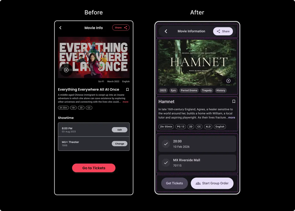
For the final iteration, I focused on going beyond a simple sharing feature to fully developing the group-order flow. In parallel, I updated the visual design for accessibility: the first hi-fi used 11px body text (below the minimum recommended for mobile), which had compromised legibility throughout. Bringing the base text to 14px resolved the legibility issues and produced a more consistent visual system throughout.
Group Order vs. Sharing Feature
The group order flow builds on a standard ticketing experience. A user selects a movie, showtime, and theater (all modifiable) and at checkout can choose to start a group order instead of purchasing alone. From there, they select the number of tickets and pick all seats for the group. The app calculates the split and shows each person’s share. The initiating user then selects contacts from their list and sends each one an individual payment request. Everyone pays their own ticket; no one has to cover the whole group and chase reimbursements. There is a time limit: if not everyone pays in time, the order expires.
The flow assumes all participants have the app, but given that constraint, what it removes is the coordination that normally happens outside the product entirely: the group chat, the transfer request, the “I’ll get you back.” One person organises, everyone pays, and the group goes to the cinema. View final prototype
Challenges and Learnings
The core group-order flow is fully designed and tested. What remains unexplored is everything around it: the group member’s experience (receiving a request, selecting seats, paying), onboarding for new users, and account settings. These secondary flows are where the product would need to go next to be shippable at scale.
The most clarifying moment was realising that sharing and group ordering are fundamentally different features. Building sharing-first meant I had to identify that gap through guerrilla testing, a useful reminder of how quickly a functional prototype can mask a strategic misalignment.
Mimicking a working product is powerful but can pull focus from core interactions. The feature-complete prototype felt done before the main problem was solved. Scope discipline is harder to maintain when the tool makes everything feel buildable.