Where Drone Data Meets Field Reality
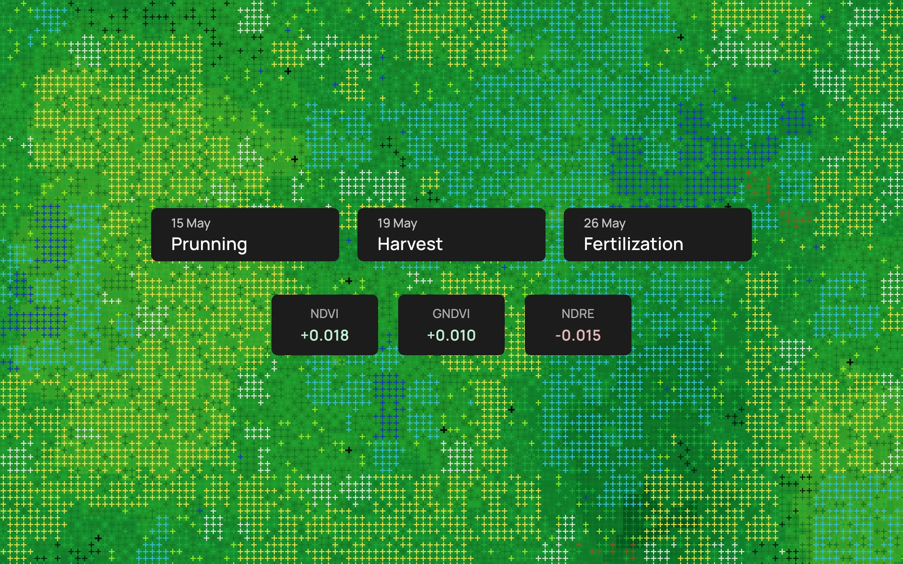
“A product [that provides visibility into field operations, along multispectral readings], would be already paid for”
— Agronomist (client), upon hearing the concept and seeing the prototype
The Data Gap That Revealed the Product
The project started as drone work and multispectral image processing with PDF deliverables of vegetative index maps and charts. The client hired our team to conduct a 12-month pilot consisting of periodic captures to explore detecting crop stress and disease, plus analyzing how to identify yield anomalies. I was the product designer on the project, and I also supported project management.
The problem: vegetative index maps can be ambiguous, require interpretation, and reading from multi-page PDFs is labor intensive. A drop in NDVI over a plot could mean unhealthy crops, or it could mean the plot was recently harvested, pruned, or chemically treated. Without knowing what happens on the ground, vegetative indexes are a powerful guide but not a diagnosis. We asked for historical field records to cross-reference with vegetative indexes. However, the client did not have a formal archive or a record-keeping practice of this kind.
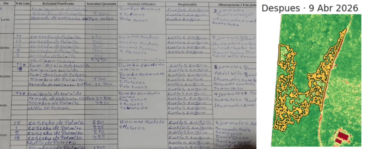
The farm supervisor tracked daily work mentally and on their notebook. Records made sense to them, but they were not structured or searchable for the team. This was not negligence, it was the reality of how operations ran before we asked for the data.
As we worked on multispectral image analysis, we requested field records in order to better interpret vegetative indexes. The Lead Agronomist made a template for work to be registered and delivered weekly by the Farm Supervisor.
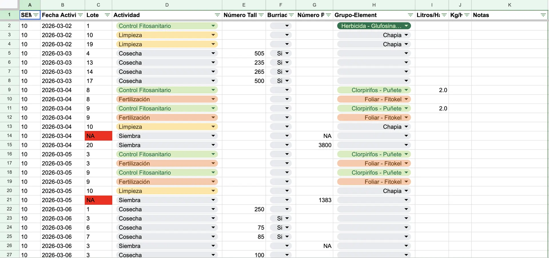
The client handed us this data and I digitized it. We could start to make sense of the multispectral readings and we had a proof of concept for the product. I set out to synthesize this manual loop field → paper → scan → spreadsheet → analysis into an operational platform, which at the same time had to properly display maps and map comparisons between capture dates.
| Before | After |
|---|---|
| Field activity recorded on paper: ~3–6 records per day, handwritten by the farm supervisor | Structured digital field records, logged directly from the office desktop and mobile responsive site |
| Data manually transcribed into a spreadsheet: hard to read, errors, omissions, and interpretation gaps at every step | Activity data organized per plot, per activity type, per unit of measure, per worker, ready to cross with drone flight data |
| No interactive aerial view, no vegetative health readings at hand, no structured record of any kind | Aerial interactive map with radiometry layers, geo-referenced control zones, organized records and notes |
Built on the Fly
This was not a traditional UX project, and I have come to think that was a good thing. Operating without a dedicated discovery sprint, research budget, or set timeline, the product had to evolve in parallel with an active client engagement. As there was not much room for a formal research phase, every client session and site visit counted as our primary means of discovery.
The same compression applied at the development end. The prototype was never a deliverable that ended my involvement. It was the artifact that carried design intent into dev’s codebase, and staying close to it through the build was key to the job.
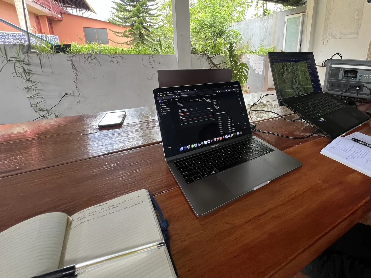
Discovery ran across 10+ client sessions and 6 farm visits over three months. Recurring conversations surfaced operational frustrations; on-site time made them concrete. Watching how the general manager, agronomist, and supervisor actually coordinated work clarified what the platform needed to do: more information than a brief could have gathered.
There is also a longer backstory. More than a year ago, working on the first precision agriculture engagement (different client, different crop), I had designed and prototyped a multispectral data viewer in Figma: a map-based interface for reading vegetative index data from above, viewing planimetric layers, and navigating the farm per plot. The project did not move past the pilot stage. Budget and software development costs made it unviable. But all the research, prototyping, and thinking about how to interpret spatial data stayed with me. When this project needed a similar capability, the foundation was already there.
Simplicity at the Center
The early concept centered on a full office-to-field task flow: administrators create tasks on desktop, supervisors receive and execute them on mobile. It made sense on a whiteboard and in concept. Client sessions told a different story. The actual urgency was simpler: get field activity into structured digital form to be able to take actions now. A task management layer added coordination overhead the client was not ready to absorb. I made the call to build field recording first and treat task management as a later phase, once the habit of digital logging was established.
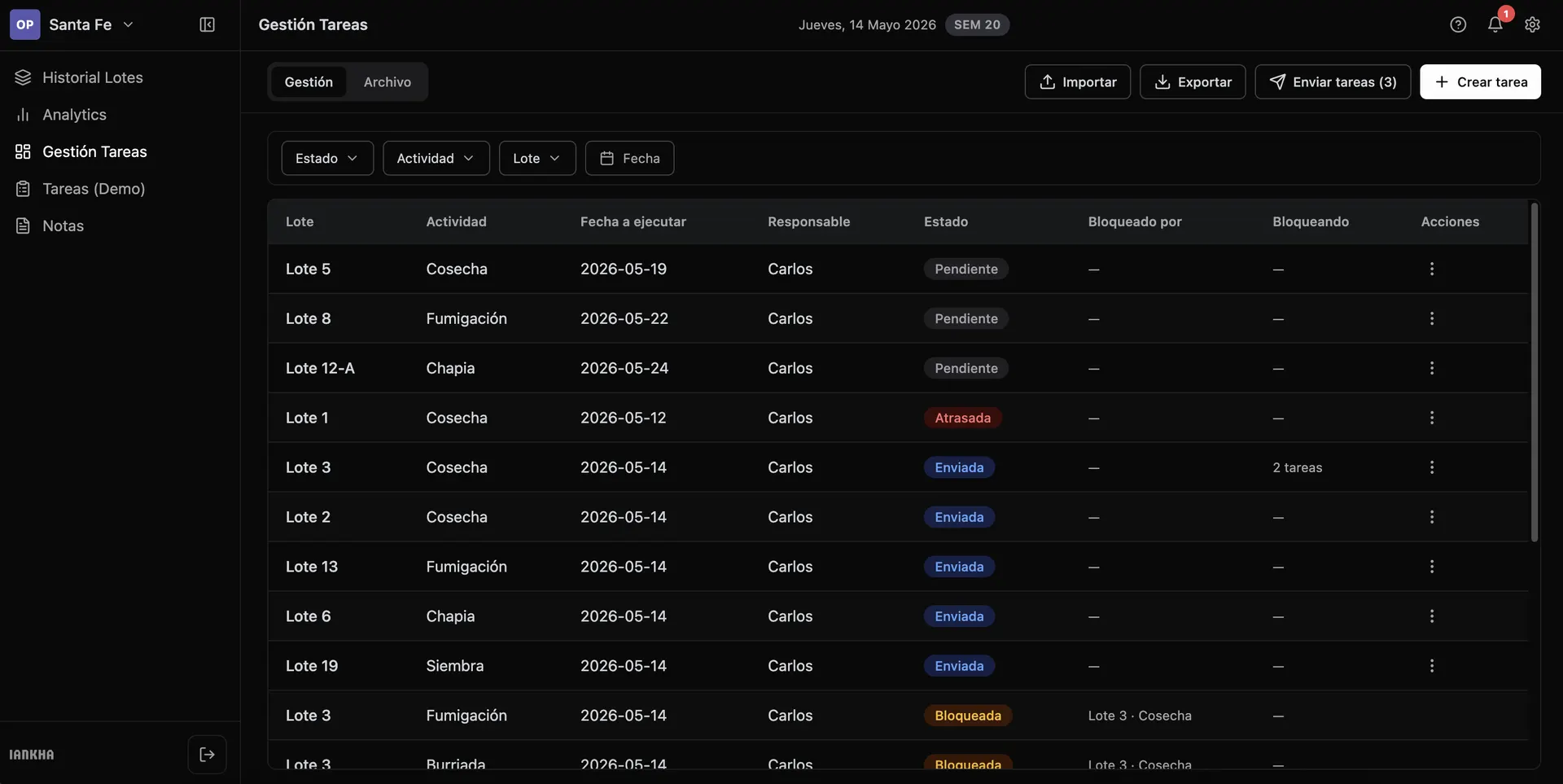
Getting the recording form right turned out to be its own design problem. The first version was a catch-all form of categories and general fields. It felt thorough, but in practice, it led to messy data and a fragmented structure. Agricultural work is activity-specific. The solution was to surface only the exact fields each activity required: stem counts for harvests, product quantity for fumigations, and specific multi-metrics for soil sampling. By matching the form to the activity, cognitive load dropped and the data got cleaner.
However, activity-specific fields only solved the immediate problem. The deeper challenge was scale: what happens with a different crop or an unanticipated activity? Hardcoding fields would just defer the rigidity, making every future change dependent on engineering.
I designed a Template Creator. First, I researched and mapped the logical relationships between activities, groups, elements, and units of measure in a Google Sheets table. That structure became Settings > Templates, where administrators can activate preset activity templates or build new ones from scratch, defining the activity name, organizing fields into groups, and assigning units of measure (Liters/Ha, Stems, pH, etc.). Because the core form shell remains the same across all activities, the template simply drives what appears at runtime. The goal was flexibility at scale: adapting to a different farm, crop, or workflow without requiring engineering involvement.
Months into production, new activities are absorbed by configuration rather than engineering, and a second client onboarded onto the same template system. The model underneath it did not survive unchanged, but that comes later in the story.
Reading the Land
The recording layer solved the input problem. The harder question was what to do with the output. Spectral data is ambiguous without field context. Our imaging team delivered precise, calibrated, plot-level readings: NDVI, GNDVI, NDRE, and overall deficiency areas vs. vegetative vigor. Those numbers were mathematically real, but what they actually meant depended entirely on what happened on the ground during the measurement window. A plot showing lower index numbers right after a heavy harvest means something completely different than a plot showing those same numbers with no recent activity. The spectral signatures look similar; the interpretations do not. To bridge this gap, I developed “State”: a two-level health indicator.
Tier 1 (Spectral): Raw deficiency percentages place the plot into a baseline category: Healthy, Moderate, or Critical.
Tier 2 (Contextual): If a recent activity (like a harvest) explains the vegetation drop, the State automatically adjusts, softening a Critical reading to Moderate.
When the two tiers diverge, the platform displays both in a spectral → interpreted format. By seeing the raw signal alongside the contextual reality, the agronomist gets more information at a glance and can decide exactly how to act.
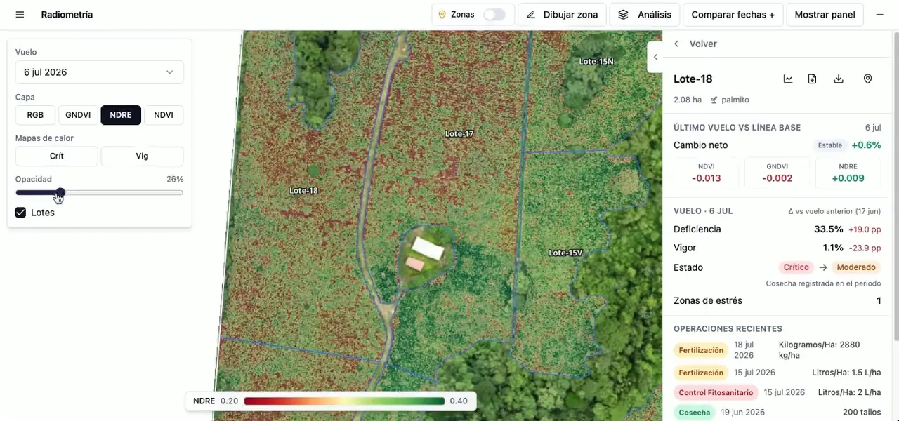
To make this data truly actionable at scale, we integrated Control Zones (developed by the engineering team). These are specific geo-referenced sub-areas within a plot that can be flagged and tracked independently across drone flights. Users can draw polygons or circles on the map to define control zones and add relevant notes directly within the platform. To navigate to these zones in the field for a diagnosis, users can generate a Google Maps pin or export a KML file to their smartwatch or offline maps app.
Ultimately, this is a design for attention management under tight, real-world constraints. Agronomists typically visit a farm just once or twice a month, often enduring three- to seven-hour journeys each way. They cannot thoroughly walk the entire property in a single day. Vegetative index maps allow them to “read” the entire farm before they even arrive: instantly knowing which plots warrant urgent attention, which ones explain their own data through recent activity, and precisely where to spend their limited hours on the ground. The question shifts from “Where do I start?” to “I already know where to go.”
The Platform
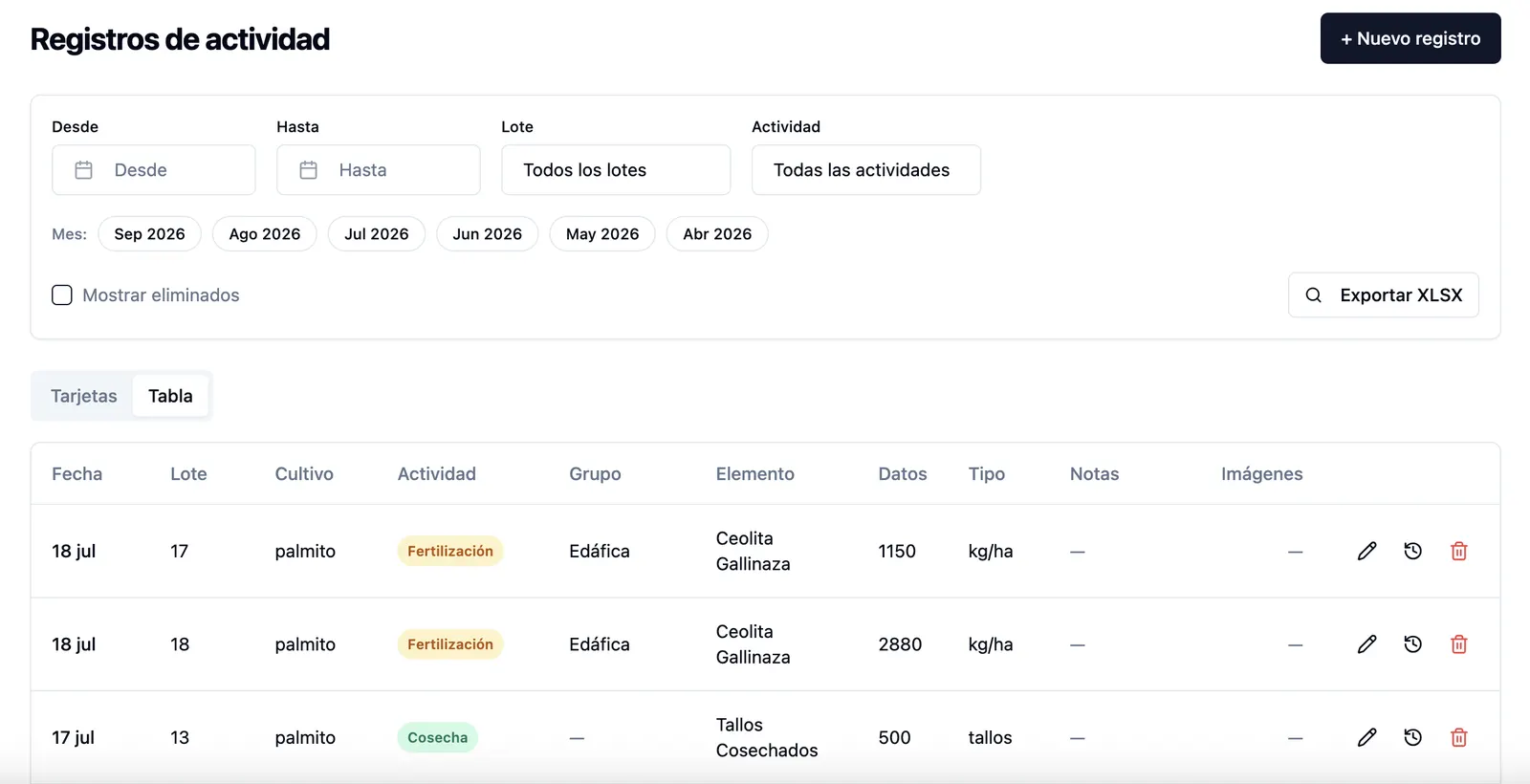
The desktop app is the office administrator’s primary workspace, turning complex farm logistics into a clean, predictable workflow:
- Dynamic Forms: Selecting an activity automatically renders the correct form from its matching template.
- Activity Feed: A centralized log of all farm activities, filterable by date, plot, or type, with
.xlsxexport capabilities. - Unified Data: Spectral data, plot-level State indicators, and Control Zone management sit directly alongside operational records.
- Administration: Dedicated modules for managing workers, supervisors, templates, and in-app contextual help.
From Prototype to Production
Although I did not write the code, the development team received a specification dense enough to build from: a CSS token system with an inventory of 14 reusable components, a full-fidelity interactive prototype built with Claude Code, and a Functional Specifications Document covering user roles, the data model, API contracts, and business rules.
The prototype did the work that written specification cannot. It was never meant to become production code, but it removed a whole category of ambiguity: instead of interpreting a description of how the dynamic form behaves, the developer could open it and use it. The FSD covered what a prototype cannot show: permissions, validation, and what happens when things fail.
Delivery is where design intent starts to drift, and the drift is rarely visible from outside: a field that renders differently than specified, a rule implemented for the common case only, a screen that works until the data stops being sample data. So I tracked the live system as built against the system as designed throughout development, and worked the difference between the two.
The prototype outlived the handoff as well. It is still where new modules and flows get designed before they reach the roadmap, which means proposals arrive as something the team can open and click rather than a description they have to imagine.
Post-Launch Iteration
Since launching in June, the work has not been a maintenance phase but a review cadence: go through the live platform, find where it diverges from intent or from how people actually use it, and write the corrections up as numbered items the developer can build against. Every item carries a stable ID, a priority, its dependencies, an explicit Done when, and a Verify step: the literal check to run to prove it works. Written that way, an item can be picked up by a person or by an AI coding assistant without further explanation, and “finished” becomes a testable claim rather than a judgment call.
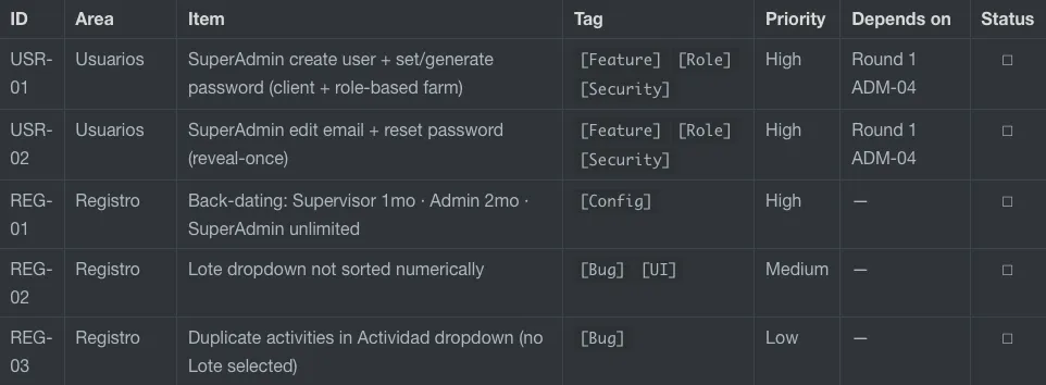
The clearest argument for reviewing what ships: the live harvest form had no field for entering the number of stems. Harvest counts are the entire purpose of that template, and there was no way to record one. Planting had the same gap. Nobody had built it wrong, exactly. The form generates itself from its template, and the stem element had never been configured with a numeric metric, so the form correctly rendered nothing. It is the kind of gap that no specification catches and no code review surfaces, because every layer did what it was told. It appears only when someone opens the shipped product and tries to do the job it was built for.
Watching the platform run drove three deeper changes.
The record model. A visit that applied two products was stored as a single record with both crammed into it, which left the data impossible to count or compare. Records moved to one per measurement, grouped under the visit. The data column held a formatted string instead of a number — a harvest read 500 tallos, a fertilization read Kilogramos/Ha: 1150 kg/ha — so it split in two, the value on its own and the unit beside it. Separately, the plot panel had been listing the most recent activity as of today regardless of which flight date was open, which breaks the premise of the product: a reading means one thing after a harvest and another without one, but only if the activity shown comes from the same window. Every record already in the system had to be rewritten, so I scoped the work as a migration and asked for sign-off before any of it was built.
Permissions as data protection. Template management moved off the Administrator role entirely. Templates define the shape of every record the platform stores, and a client administrator editing one mid-season would silently change what the existing data means. That is a permissions decision, not a feature. The same specification added a SuperAdmin role above the client’s administrators, so our own team could provision accounts across clients, paired with an append-only log of that access.
The analytical turn. The original thesis was visual: put the vegetative index map beside the operational record and let an agronomist read the two together. Running the platform has pushed the work toward the numbers behind both, index values and harvest figures tracked over time, and toward analytics rather than interpretation by eye. Whether a deficiency reading is explained by a harvest is, in the end, a question about the relationship between two quantities. That is what we are designing for now.
What is Next
Validating the MVP. Once the high-fidelity designs are implemented in the MVP, the next stage is moderated usability sessions with end users to validate the desktop experience. Core tasks (reading spectral states, registering harvests, annotating control zones) will be measured against baseline metrics:
| Metric | Method | Target |
|---|---|---|
| Task Completion Rate | Observed per task | ≥ 80% |
| Critical Error Rate | Observed per task | 0 |
| System Usability Scale (SUS) | Post-session questionnaire | ≥ 70 |
A second round will test the records module, ensuring field supervisors can reliably log activity despite variable digital literacy and frequent offline conditions.
Closing the loop with mobile. Insights from the records module test will drive our mobile phase. Syncing offline field captures to the desktop platform is the final gap between how the software works and how the farm works. Following mobile, we will introduce work management, a task layer cut from the original MVP scope.
Go-to-market and long-term vision. As a startup, commercial reality drives our roadmap. We are actively taking the MVP to market and using new client onboardings to prove our architectural models generalize across different operations.
Ultimately, the value of this system will compound over time. By pairing continuous field logs with historical spectral data, we can finally provide an automated, data-driven answer to the core question that sparked this entire project: “Is that stress signature a dying crop or just a recent harvest?”